Arizona Opera • Phoenix Journal
Arizona Opera illustrations review on the Downtown Phoenix Journal by Jill Bernstein
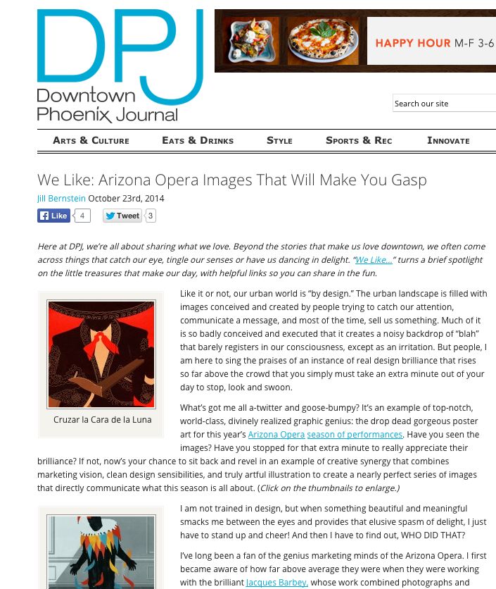
Like it or not, our urban world is “by design.” The urban landscape is filled with images conceived and created by people trying to catch our attention, communicate a message, and most of the time, sell us something. Much of it is so badly conceived and executed that it creates a noisy backdrop of “blah” that barely registers in our consciousness, except as an irritation. But people, I am here to sing the praises of an instance of real design brilliance that rises so far above the crowd that you simply must take an extra minute out of your day to stop, look and swoon.
What’s got me all a-twitter and goose-bumpy? It’s an example of top-notch, world-class, divinely realized graphic genius: the drop dead gorgeous poster art for this year’s Arizona Opera season of performances. Have you seen the images? Have you stopped for that extra minute to really appreciate their brilliance? If not, now’s your chance to sit back and revel in an example of creative synergy that combines marketing vision, clean design sensibilities, and truly artful illustration to create a nearly perfect series of images that directly communicate what this season is all about. (Click on the thumbnails to enlarge.)
Full article here